Map of San Francisco’s Presidential Candidate Choices by Neighborhood
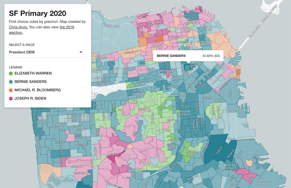
See which precincts voted for Bernie, Elizabeth, Michael, Pete or Joe – Chris Arvin created a fun and informational map that lets you explore your neighbors voting choices, if you’re so inclined. The map also covers how San Franciscan’s voted on local propositions and candidates.
Visit the interactive map and follow the local transit fan on Twitter.
According to Chris Arvin, the map updates every 10 minutes from when sfelections.org releases data “with caveats”
Want to dig deeper on local election stats? KQED has a new election design with great info for the entire San Francisco Bay Area here.