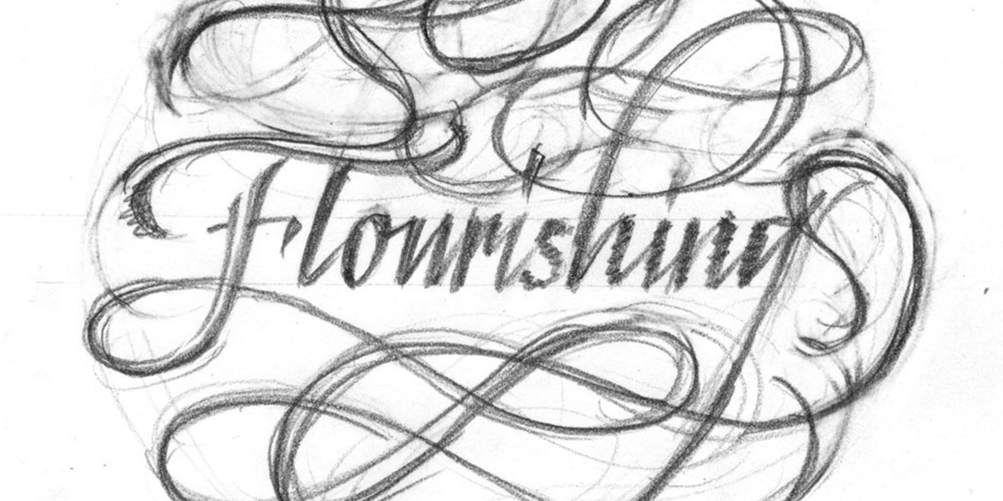
Good flourishing is not the result of “happy accidents”. Flourishing is most effectively employed in a systematic way, instead of relying on spontaneity. In this class, we will go over the basic rules and principles of designing the flourished line. We will examine high quality flourished work, learn how to identify basic elements of well-executed flourishes, dissect what makes good flourishing pleasing to the eye, and combine the elements to create our own designs. As we go through exercises, we will cover methods of combining flourishes in a visually pleasing way, with particular emphasis on white space and hot spot control, scale, intersecting angles, smoothness, and rhythm.
Required Materials:
Grid paper
Tracing paper
Layout bond paper (Borden & Riley #37, Canson Marker Layout, or Bienfang Graphics
360)
Ruler
Pencil and sharpener or mechanical pencil with refills
Eraser
Tape (artist’s or masking)
1-2mm chisel tip marker or pen (e.g., Sakura Pigma calligraphy markers, Zig calligraphy chisel tip markers, chisel tip fountain pen, etc)
Lynne Yun is a Type Designer who specializes in all types of letterforms. From crafting handwritten calligraphic pieces to designing type for the screen, she enjoys the balancing act of form and function that is required when designing tools for communication. She enjoys sharing the joy of her craft through public speaking engagements and teaching workshops for organizations such as AIGA, TypeCon, and the Society of Scribes. Lynne’s previous positions include being a designer at Apple Inc., Publicis, and Deutsch. Her work has been recognized by organizations such as AIGA, Type Directors Club and Art Directors Club. She currently works at Monotype and serves on the board of AIGA NY.
show less
Required Materials:
Grid paper
Tracing paper
Layout bond paper (Borden & Riley #37, Canson Marker Layout, or Bienfang Graphics
360)
Ruler
Pencil and sharpener or mechanical pencil with refills
Eraser
Tape (artist’s or masking)
1-2mm chisel tip marker or pen (e.g., Sakura Pigma calligraphy markers, Zig calligraphy chisel tip markers, chisel tip fountain pen, etc)
Lynne Yun is a Type Designer who specializes in all types of letterforms. From crafting handwritten calligraphic pieces to designing type for the screen, she enjoys the balancing act of form and function that is required when designing tools for communication. She enjoys sharing the joy of her craft through public speaking engagements and teaching workshops for organizations such as AIGA, TypeCon, and the Society of Scribes. Lynne’s previous positions include being a designer at Apple Inc., Publicis, and Deutsch. Her work has been recognized by organizations such as AIGA, Type Directors Club and Art Directors Club. She currently works at Monotype and serves on the board of AIGA NY.
Good flourishing is not the result of “happy accidents”. Flourishing is most effectively employed in a systematic way, instead of relying on spontaneity. In this class, we will go over the basic rules and principles of designing the flourished line. We will examine high quality flourished work, learn how to identify basic elements of well-executed flourishes, dissect what makes good flourishing pleasing to the eye, and combine the elements to create our own designs. As we go through exercises, we will cover methods of combining flourishes in a visually pleasing way, with particular emphasis on white space and hot spot control, scale, intersecting angles, smoothness, and rhythm.
Required Materials:
Grid paper
Tracing paper
Layout bond paper (Borden & Riley #37, Canson Marker Layout, or Bienfang Graphics
360)
Ruler
Pencil and sharpener or mechanical pencil with refills
Eraser
Tape (artist’s or masking)
1-2mm chisel tip marker or pen (e.g., Sakura Pigma calligraphy markers, Zig calligraphy chisel tip markers, chisel tip fountain pen, etc)
Lynne Yun is a Type Designer who specializes in all types of letterforms. From crafting handwritten calligraphic pieces to designing type for the screen, she enjoys the balancing act of form and function that is required when designing tools for communication. She enjoys sharing the joy of her craft through public speaking engagements and teaching workshops for organizations such as AIGA, TypeCon, and the Society of Scribes. Lynne’s previous positions include being a designer at Apple Inc., Publicis, and Deutsch. Her work has been recognized by organizations such as AIGA, Type Directors Club and Art Directors Club. She currently works at Monotype and serves on the board of AIGA NY.
read more
Required Materials:
Grid paper
Tracing paper
Layout bond paper (Borden & Riley #37, Canson Marker Layout, or Bienfang Graphics
360)
Ruler
Pencil and sharpener or mechanical pencil with refills
Eraser
Tape (artist’s or masking)
1-2mm chisel tip marker or pen (e.g., Sakura Pigma calligraphy markers, Zig calligraphy chisel tip markers, chisel tip fountain pen, etc)
Lynne Yun is a Type Designer who specializes in all types of letterforms. From crafting handwritten calligraphic pieces to designing type for the screen, she enjoys the balancing act of form and function that is required when designing tools for communication. She enjoys sharing the joy of her craft through public speaking engagements and teaching workshops for organizations such as AIGA, TypeCon, and the Society of Scribes. Lynne’s previous positions include being a designer at Apple Inc., Publicis, and Deutsch. Her work has been recognized by organizations such as AIGA, Type Directors Club and Art Directors Club. She currently works at Monotype and serves on the board of AIGA NY.
show less
Date/Times:
The Best Events
Every Week in Your Inbox
From Our Sponsors
UPCOMING EVENTS


Great suggestion! We'll be in touch.
Event reviewed successfully.